Has this ever happened to you? I bought Raisin Bran Crunch instead of Raisin Bran. For the third time. I only discovered my error when I got home. Arrgh! I hadn’t noticed the subtle differences in the packaging!
Your packaging has 4 seconds, at most, to capture the consumer’s attention as they stroll down the aisle at retail. You want the brand to be cohesive, and yet have variations in product type that make it easy to distinguish. How strong should your line look be? The answer is – it depends.
At Adrenaline we often talk to clients about considering the line look on a scale from 1-10. Number 1 represents a strong line look (Raisin Bran!) and 10 means a distinctive package that may only be tied to others in the line by a small logo and trade dress (such as games). Several factors can help determine the right direction for your brand’s identity.
Is it a new brand in the marketplace?
When you are building an identity, a stronger line look (2-3 on our scale) can make your brand more memorable to the consumer. But, it’s important to develop a brand architecture that can grow with your brand.
In the beginning, you’re looking for initial takeaway and those important repeat purchases. If your packaging is distinctive compared with others on the shelf, it will be easy to find. That’s good! Be sure to compare your selected design with the competition. It is of paramount importance for new brands to specifically target packaging colors and branding that ensure differentiation from their competitors. Getting noticed is the goal!
What are the top 2 or 3 important messages?
Some of the questions we ask at the beginning of a project are: What makes your product special? Why will a consumer want to buy your brand? Spend time to develop a brand personality. Uncover your products’ unique benefits. How do you want your brand to be perceived? How can you connect emotionally with the consumer?
Boil it down to the cleanest communication possible for the packaging front. This is where an objective eye can help: Keep the clutter down, and rely on the sides and back to fill in details if the consumer is interested. Successful packaging is often an exercise in restraint. The key elements are the brand and the product, and then variety and benefits; but not necessarily in that order.
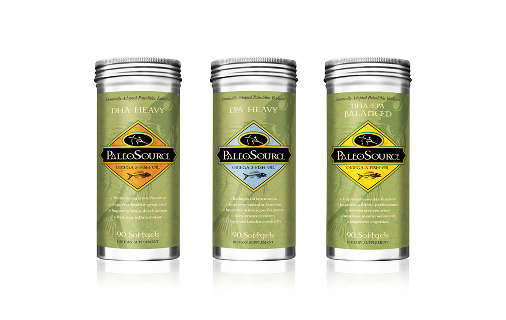
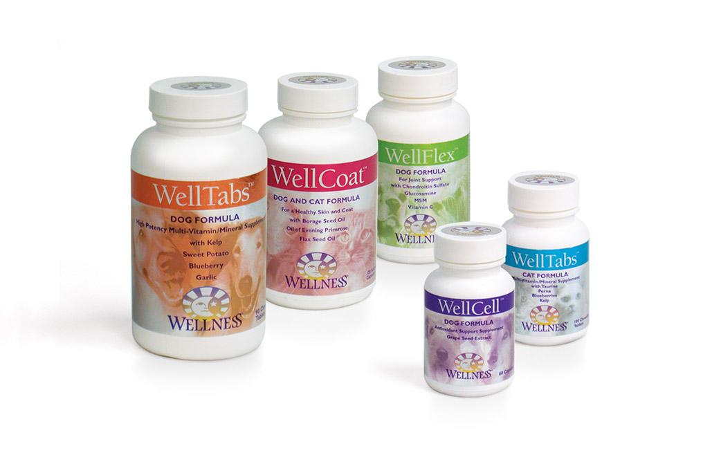
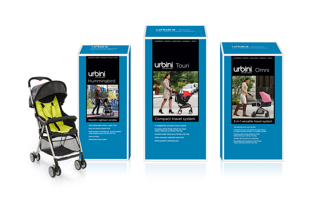
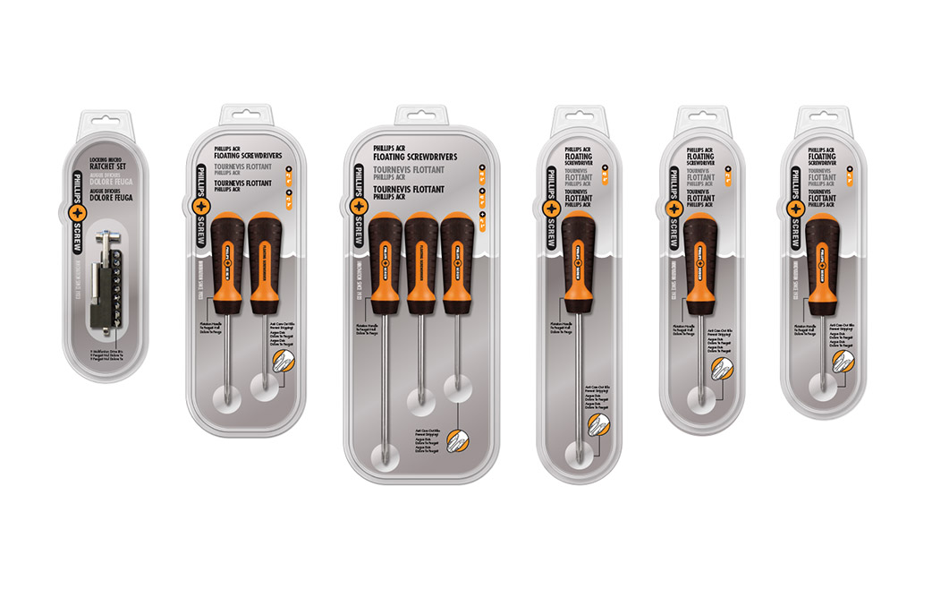
Develop a trade dress that can help to distinguish between your products. This can involve shapes, colors, sub-brands, illustrations or photographs, and taglines. Save the shopper time by making it easy to select the product that suits their needs (I really don’t like Raisin Bran Crunch!)
Do you expect to create a large number of product extensions?
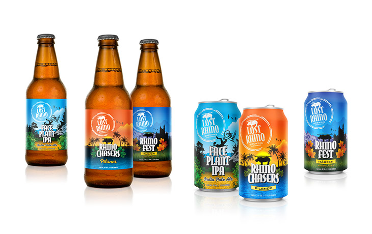
For example, beer packaging can extend endlessly with new brews, seasonals and flavors. Color cues are very important in helping consumers take home the right product. With strong brand architecture, creating differences through color can be a winning strategy. You don’t want customers having to read the details to differentiate. Remember, they are shopping with distractions – maybe holding the hand of a tugging toddler or talking on the phone – so don’t make it difficult for them.
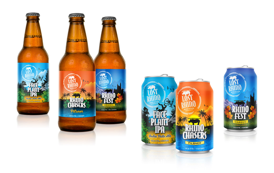
Your branding platform should be distinctive and flexible enough to extend to added product varieties, or even branch outside of the original category. This is where a looser line look (6-9 on our scale) can pay off. When products in a line will vary considerably, flexibility will help convey the personality of each item.
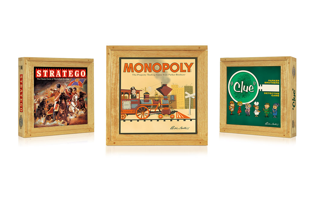
A good example of this is game packaging. While the maker and/or license will be important to shoppers, the individual items must distinguish themselves enough for the consumer to want to own more than one. Even better if they want to own them all!
How to avoid the trap?
At a minimum, Adrenaline recommends initially designing several packages in a line, and possible line extensions into other categories. The initial investment to create a packaging strategy will pay off. The line should be united as a brand while each product stands on its own and as a separate offering. Don’t fall into the Raisin Bran trap!
For packaging that will fuel sales at retail, call Nan at 978.525.4800.